Design challenge
Create a strong mood through typography, colour, and imagery without sacrificing clarity.
Project 2 · WordPress restaurant website
A fictional cocktail bar website designed to feel refined, atmospheric, and easy to navigate.
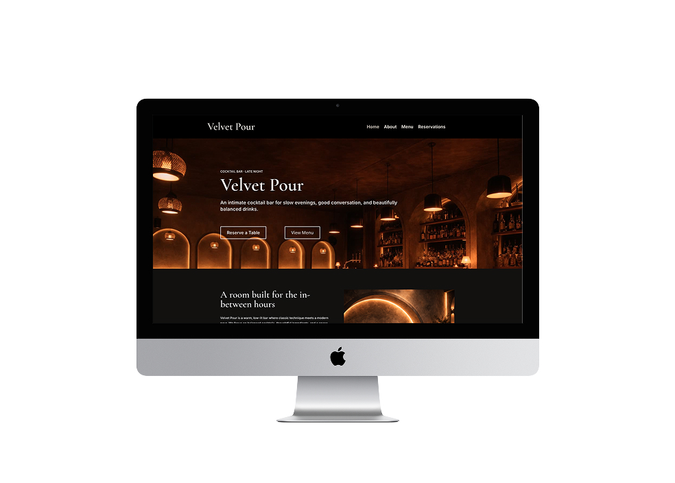
Velvet Pour is a fictional cocktail bar website created as a WordPress restaurant project. I designed the brand direction, content hierarchy, and responsive layouts, then translated the concept into a polished multi-page site built for desktop, tablet, and mobile.
Overview
The goal was to create a site that felt intimate and atmospheric while still making essential actions like browsing the menu, learning about the bar, and making a reservation clear and easy to access.
This project was created in response to a course brief focused on designing and building a responsive WordPress website for a restaurant or eatery. The final outcome needed to combine a simple brand system, strong imagery, and modular layouts with a clean user experience across screen sizes.
Challenge
Restaurant sites need to do a few things well, fast. Visitors should immediately understand the vibe, find the menu, and access reservation information without hunting through cluttered content.
For Velvet Pour, I wanted the site to feel warm and polished, with a sense of evening atmosphere, but still stay clean and structured enough to work across desktop and mobile.
Design challenge
Create a strong mood through typography, colour, and imagery without sacrificing clarity.
User need
Make it easy to understand the bar, browse the menu, and move toward reservations.
Brand direction
The brief required a simple brand identity using a wordmark, a limited colour palette, and one or two Google Fonts. That pushed the design toward restraint rather than decoration, which suited the cocktail bar concept well.
I leaned into a darker, warmer visual tone to support the feeling of an intimate evening space, then balanced that with clean layout spacing and readable typography so the site still felt modern and functional.
Deep oxblood
Used to create a rich, intimate evening atmosphere across the site.
Soft cream
Balances the darker palette and keeps the interface readable.
Muted brass
Adds warmth and a subtle premium accent to buttons and highlights.
Responsive design
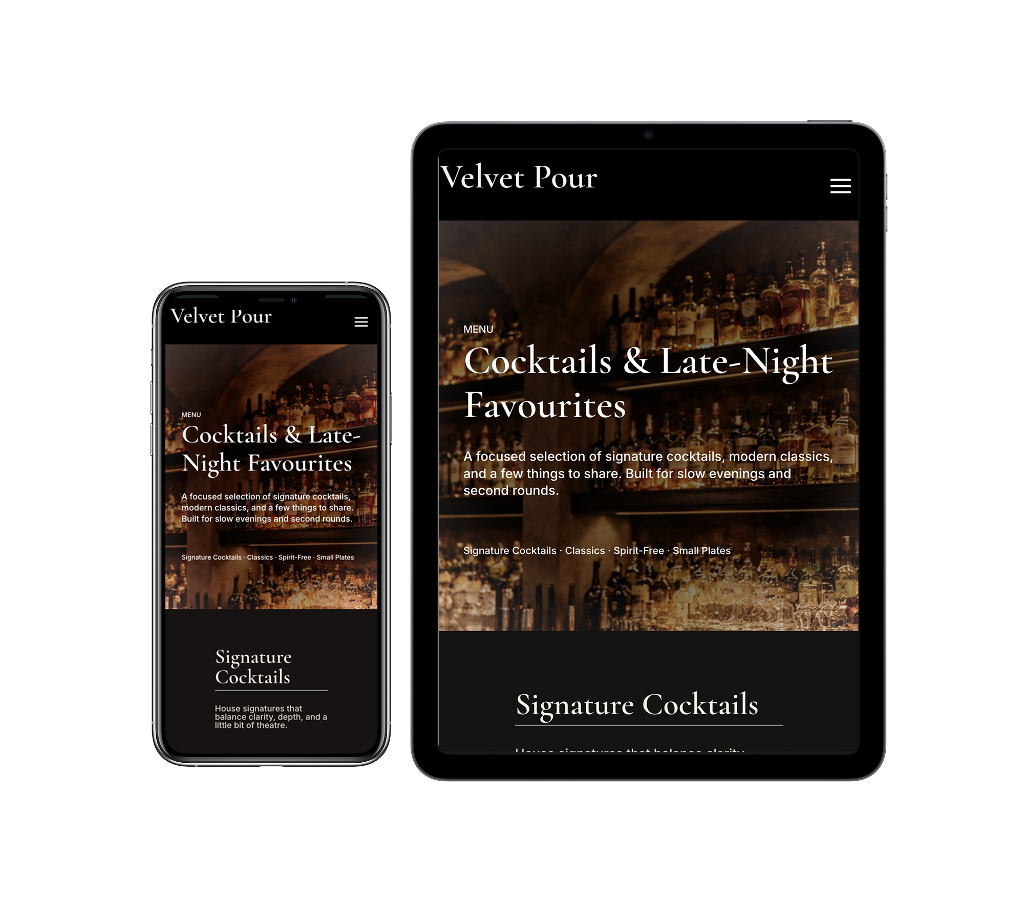
I used Velvet Pour as a fictional brand concept and built the site around the core tasks a visitor would expect from a cocktail bar website: understanding the atmosphere, exploring the menu, finding practical information, and making a reservation.
Design decisions
Rather than overloading the site with too many decorative sections, I centered the experience around a few essentials: discovering the brand, previewing the menu, and reserving a table. This kept the homepage focused and made the navigation more intuitive.
The layout also had to work within WordPress and Divi, so each section was designed to function as a flexible content block that could stack cleanly across breakpoints. That made consistency and spacing especially important throughout the build.
Typography
Clear hierarchy, readable body copy, and simple headings.
Layout
Modular sections, consistent spacing, and responsive stacking.
User experience
Clear navigation, obvious calls to action, and quick access to key info.
Reflection
This project helped me think more realistically about how visual design decisions hold up when translated into an actual website build. Working within WordPress meant I had to simplify, prioritize, and make stronger decisions about hierarchy instead of relying on purely conceptual layouts.
Velvet Pour became a useful exercise in designing for both mood and usability. The final site balances atmosphere with structure, creating a brand experience that feels polished while still supporting the core tasks of a restaurant website.